We’re coming to the end of 2021 and about to enter 2022. It’s a great time to start putting together a new website for your business. But which website builder should you choose? You’ll have seen that there are lots of options to choose from. There are three big contenders in the space at the moment – WordPress, Wix and Squarespace.
WordPress – The Industry Giant
WordPress has been around for a long time now – about 18 years, it has matured a lot in that time. It is hugely popular, over ⅓ of websites use it! That’s for good reason too. It’s hugely flexible, with a wealth of plugins available that can add almost any functionality you can think of. There’s literally thousands of themes to get you started too. Sounds great, and it is, but it can be quite overwhelming if you haven’t used it before. By default, without any plugins, WordPress makes for a fantastic blogging experience and gives you the ability to put together some fairly simple but clean looking content pages too.
It is hugely popular, over ⅓ of websites use it!
However, as soon as you want to do anything more complicated, such as selling products, or using more complex and customisable pages, you’ve got to start working with plugins. Either that, or you can delve into the code and start adding features yourself. Plugins can vary from tiny little modifications that you barely even notice, to huge, complex page builders. There’s a corresponding variation of prices too though. Plugins can vary from free, to hundreds of £s.
Aside from having something custom built from scratch, WordPress is the next best thing. But the focus of today isn’t on WordPress so we’ll leave it there for now.
Join my list to see the latest news, hints and tips for building your own business websites. You’ll get sent the recording for my latest workshop absolutely FREE too!
Squarespace & Wix
Funnily enough, Squarespace is about the same age as WordPress – released in 2003. Wix is a little bit younger as it was released 3 years later. They’ve all had plenty of time to mature into the fantastic products they now are, to help you put an awesome website together.
Squarespace and Wix, let’s start with their similarities. They are both there to serve the same purpose – to allow you to build your website with as little pain as possible but still have something that satisfies your needs, and gives you all the functionality you want. They both also host the website for you, and can handle your domain name too if you don’t want to do that yourself.
Both are aimed heavily at allowing you to focus on designing your website and writing your content, rather than fiddling about with plugins, code and all that stuff. However they tackle this problem very differently; they both have plugins, or ‘apps’, you can add to your site. These give you more capabilities which aren’t included by default. The plugins are often created by Wix or Squarespace themselves anyway, so you know they will work well. When made by a 3rd party, they’re still checked to make sure they’re safe and will do what they say they’ll do.
They both also let you add shops, blogs, contact forms and pretty much anything else you could reasonably want. To some extent, even their interfaces have quite a lot of similarities, at least at a glance; we’ll get more into that shortly. The big question is, “Do they produce good websites?”, and the answer to that is, “Yes! Yes they do!”. But… which should you choose? That’s a different question altogether, and the answer to that is, “it depends”… But really, you can’t go wrong choosing either of them.
The big question is, “Do they produce good websites?”, and the answer to that is, “Yes they do!”
Squarespace
Laying Out Content
Squarespace really wants you put together sites, with a ‘clean’, and ‘modern’ design. Page content is split into ‘sections’, which are essentially rows.
Within those sections you add ‘blocks’, which are chunks of content. For example if I want a paragraph of text, I’d add a ‘text’ block. You can drag these blocks around and put them next to, on top of, or overlapping each other. There’s a lot of flexibility on how you can align things within a section! However, in going for that clean aesthetic, you don’t have much more freedom than attaching blocks to each other. The flexibility to put things exactly where you want them, just isn’t there.
There’s an upside to this though – your content will look great and size properly to whichever device it’s being viewed on (which, trust me, can be a pain). And, this is done without you doing any extra work! Squarespace is able to handle all the repositioning and resizing for you, freeing up your time for showing off your stylish website.

Styling Content
One thing that’s really bugged me when working in Squarespace is that you cannot click directly on a block of text to style it. Squarespace has set styles of text for your whole site; so you set styles for each size of heading, each paragraph, etc. When you want to change any of these, you have to open up a separate menu to edit them, it’s just a bit cumbersome to use really. However, once you’ve set these styles up, if you change one, everything else with that style will change to match it.
Commerce and Blogging
Setting up your shop on Squarespace, is easier than setting it up on any other platform. When you click the button to add ecommerce to your site, it takes you through the steps one at a time to add products, setup payment methods, delivery options, everything you really need. It will even let you import products from an existing shop like Etsy or Shopify, without you having to input them all yourself.
Blogs are even more straightforward. Once you’ve written and published your first blog post, you can add the “Blog” button to your site’s menu. And that’s it! Of course, there’s a lot more customisation you can do to your shop and blog but it’s that simple to get them up and running to start with.
Advanced Editing
As someone who is used to building websites from scratch and laying them out with code, I really like to dig in and tweak things manually, to get them exactly how I want them. Depending on your subscription tier of Squarespace, you get different levels of code editing capabilities. The highest tier allows you to edit the code for absolutely everything on your site. At the most basic level, Squarespace lets you build blocks with your own code in. So in a way it lets you bypass the strict positioning options of blocks as you can build your own and place them wherever you like.
It’ll also let you set your own text styles per block if you want to do that, but of course it comes with the caveat that it’s more complicated to edit than just using dropdowns, sliders and buttons.
Squarespace Overall
If you want building your website to be as simple as possible, Squarespace will pretty much hold your hand the whole way through. If you don’t have an eye for design, or you just don’t have the time or will for the complex side of web-development, you’ll have a great time with Squarespace. It lets you focus on putting your content together over anything else. If content is what you want to focus on, it’s probably the choice for you!
Wix
Laying Out Content
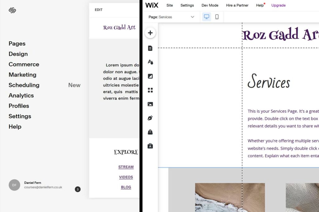
At first glance, Wix appears to be very similar to Squarespace in layout. You’ve got your main controls on the left of the editor, for pages, design etc. It’s where you’ll find most of the things you’ll need!

If you enjoy design, you’ll like Wix. Unlike Squarespace, it allows you to place elements anywhere you want to on a page. It has grid lines you can use to align things to. But elements don’t ‘snap’ to the grid lines in the way they do in Squarespace. It’s a very versatile system. However, if you want a more Squarespace-esque experience, There is a plethora of pre-designed “strips” available for you to use. These are Wix’s equivalent to Squarespace’s “sections”.
Styling Content
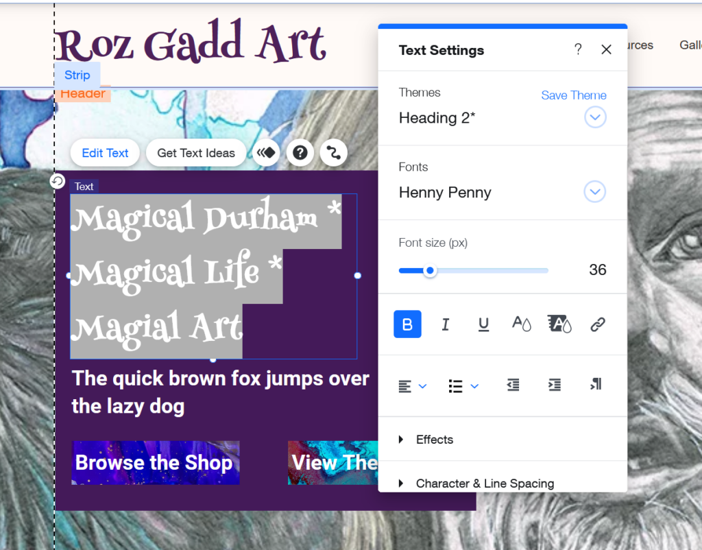
Just like page layout, styling in Wix also has a lot of similarities to Squarespace. You can set text styles for your entire site and reuse them wherever you want, to keep things consistent. But unlike Squarespace, you can set styles individually for text elements if you want to. You can also just double-click on a block of text and change the styling directly.

Commerce and Blogging
Wix makes it very easy to set up your shop and blog. When you go into the page manager and click to add a shop or blog page for the first time, it’ll walk you through the steps you need to follow to get them working. If you add a shop page it’ll take you through adding your first product and setting up payment methods. It’s a similar experience to Squarespace, and I think that’s a good thing in this case! They both provide a fantastic experience for getting your shop or blog running on your website.
Of course there is a lot more you can do with the configuration of your shop or blog on either platform, but to get something going, it’s very straightforward.
Advanced Editing
This, I think, is where Wix really falls short of most other website building tools, including Squarespace and WordPress. If you want to edit the code of a website you’ve built in Wix, you’re going to be stuck, it’s not something that you can really do. Wix does let you add custom code to certain parts of your website, but it’s only adding code, you can’t edit anything that’s already there.
The appeal of these tools is that they’re nice and quick and you know what you’re getting, but because you’re not making it from scratch it’s not going to be very personal. With this in mind, if Wix or Squarespace is right for you, you probably don’t mind the absence of custom code-ability too much. If you want to build more custom sites, you may want to go with WordPress or even writing something from scratch.
Wix have recently introduced a new platform called “Velo” that allows you to build web sites and web apps using standard programming languages using their custom editing system. I’m quite excited to have a look through it myself, but it doesn’t seem quite as beginner friendly as Wix’s standard page builder, or even WordPress as it’s very code heavy and so not necessarily for the same audience.
Wix Overall
If you enjoy working on your website’s design as well as its content, Wix provides you with an editor that you can quickly get to grips with and enjoy using to build-out your whole site. But if you want to focus a little less on design, or you’re less confident with it, then Squarespace may be the better choice for you, with it’s heavy focus on placing content in blocks that slot neatly together.
For extra website features like social media integration, contact forms, and most other things you can think of, both Wix and Squarespace have extensive libraries of plugins / extensions that you can look through. In those you’ll find pretty much everything you could want and a fair few things you never expected too.
You won’t go wrong choosing either of these platforms. They are both good at different things, and for different people. But you can be sure that you’ll end up with a really good website at the end.
But what if you want something more?
WordPress, Wix and Squarespace represent the range of tools available to make the website building process easy for you. If you want something more specialised however, there isn’t much choice available. As I mentioned earlier, WordPress can do almost anything you want. Unfortunately, it does still have some limitations. If you want something complex with special functionality, even WordPress can show its limitations. At that point, commissioning a website developer to build something custom for you, is often the best route to go. If you’re interested in that send me a message, and we can have a chat.
If you found this post helpful then let me know by commenting, and share the word with your social media community (feel free to tag me @danfernitwizard). You can also get in touch through the contact page for any extra help!
